How To Map The Market With Range Bars And Volume Spikes
By Galen Woods ‐ 6 min read
Range bars with volume spikes offer a unique market perspective for price action traders. Use it to map the market, time your entries, and limit your risk.
Range bar charts are unique tools that focus on price action. A fundamental behavior of range bar charts is that they do not move unless the market does. This attribute can help you avoid nasty congestions filled with unhelpful Doji-like bars.
When used correctly, they can grant you a unique market perspective. Yet, there’s a lack of discussion the various ways to use them effectively.
In this tutorial, I’ll show you a way to navigate the market with range bar charts and volume spikes.

Clearly, on its own, range bars add value to your analysis by clarifying price action. But you can gain even more out of it if you add volume to the mix.
Range bar charts remove time from the equation. And by doing so, it offers you the chance to focus on the relationship between price and volume.
Range bars with a volume plot offers you a glimpse into the market structure. It uncovers dynamics that standard time charts obscure. And the insights you gain can help you create a map of reliable support and resistance zones.
As a trader, you are mainly interested in support and resistance. That’s what market participants are interested in. And volume is the proxy for market interest.
How Does Range Bar Volume Analysis Work?
It’s much easier to follow the explanation below if you’re familiar with how range bar charts work.
For instance, the 5-tick range chart prints a new bar only when the market has moved more than five ticks.
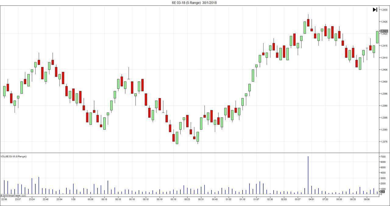
Each bar in the chart above represents the same price range. The volume plot here shows the volume traded within the price range.
You can then easily answer the questions like these:
- Did the market move five ticks with 5,000 contracts?
- Or did the market move five ticks with 50 contracts?
Why Does It Matter?
If the market traded 5,000 contracts over five ticks, it means that the market is interested in this price level.
The big players are tipping their hands. They are either accumulating or distributing their positions at this level.
These are potential support and resistance zones that you should look out for.
Whereas if the market traded just 50 contracts over five ticks, the big players are not involved. Hence, you can pay less attention here.
How Do You Set Up Your Range Charts For Volume Analysis?
Choose a range parameter. For this, you should decide according to your trading horizon and risk level. For instance, if you are a scalper, you will choose to plot a bar every few ticks.
The range parameter will determine the thickness of your support and resistance zones. For a start, you can use the average bar range of your usual trading time frame.
Place a volume panel with a Bollinger Band to identify volume spikes/extremes. (Note: The input for the Bollinger Band is volume, not price.)
In the charts below, I’m using a 233-period Bollinger Bands with three standard deviations.
Any long-term lookback period is acceptable, but I recommend using three standard deviations. Test your charts to find your preferred settings.
Examples - Market Mapping With Range Bars and Volume
To appreciate the power of these range bar volume spikes, let’s take a look at the three examples below.
For the charts below, the bottom panel shows volume with the Upper and Middle Bollinger Bands. (The lower Band is hidden.)
#1: ES Futures - 4-Tick Range
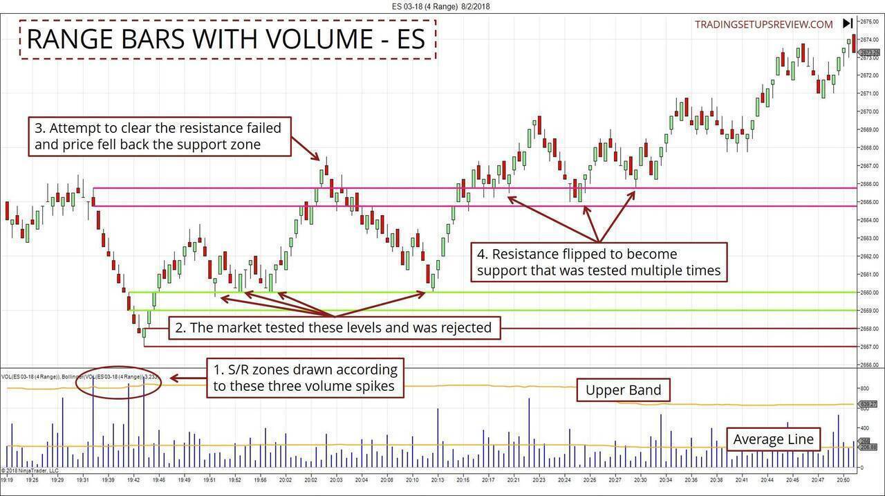
The chart above shows a 4-tick range bar chart of ES futures.
- These three volume spikes point us to three range bars. With these three range bars, we projected S/R zones: pink, green, and brown. At any point, focus on the nearest S/R zones. In this case, our focus is on the pink and green zones.
- After rising above the green support, the market tested it a few times. Each test offered a chance to enter a bullish position. For these entries, the pink resistance offered a reliable target.
- Here, the market tried breaking through the resistance, but it turned out to be a false breakout. After this failure, it was unsurprising that the falling market found support in the green zone.
- The second breakout of the pink resistance went further than the first one. Hence, it was more likely to be a valid breakout. The later tests of the pink zone as a support level confirmed that the market’s bullishness.
#2: EURUSD 6E FX Futures - 10-Tick Range
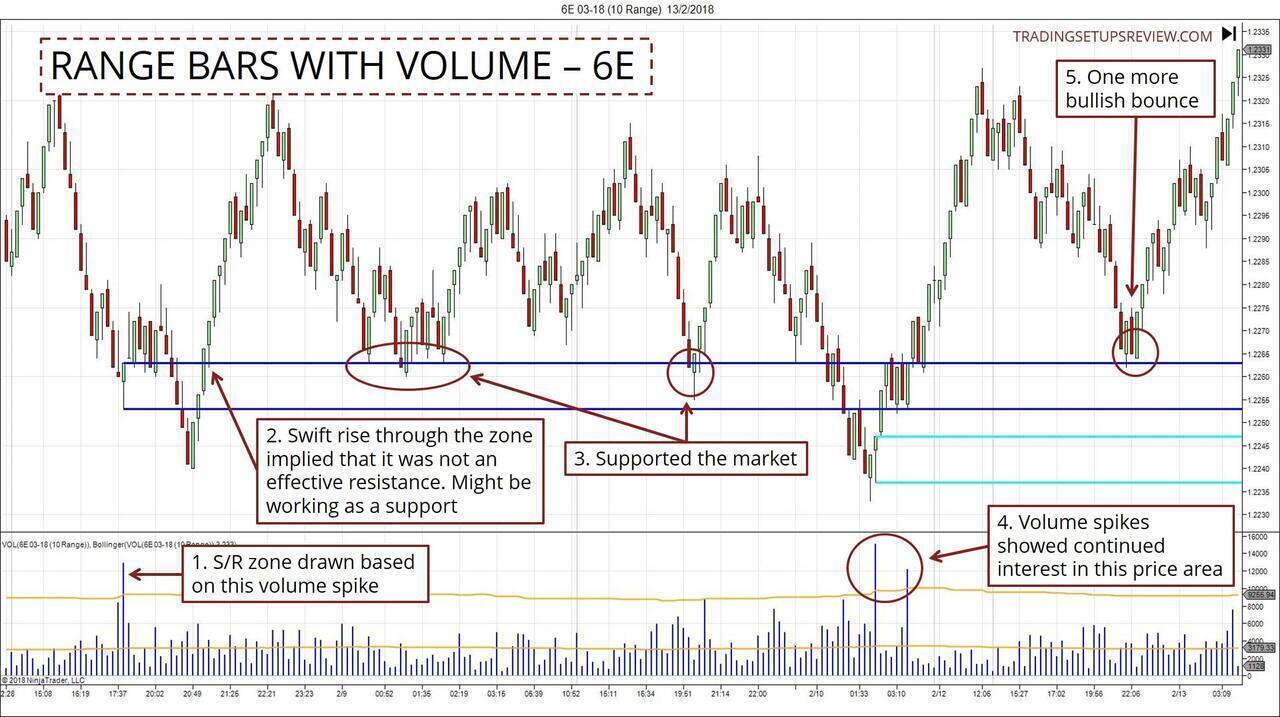
The 6E futures chart above shows multiple volume spikes within the same price region.
- We drew a price zone based on the range bar that produced this volume spike.
- This unapologetic rise through the zone implied its ineffectiveness as a resistance. More likely, the volume spike indicated accumulation.
- Indeed, the zone supported the market. And in doing so, it offered excellent entry points for bullish traders.
- The blue support seemed to have failed momentarily. But the buyers soon returned with clear volume spikes. In the circle, there are two volume spikes. The first spike led us to draw the cyan support zone. The second spike occurred right in the blue zone, confirming its market significance.
- One more opportunity to buy as the market pulled back into the resistance.
#3: FDAX Futures - 10-Tick Range
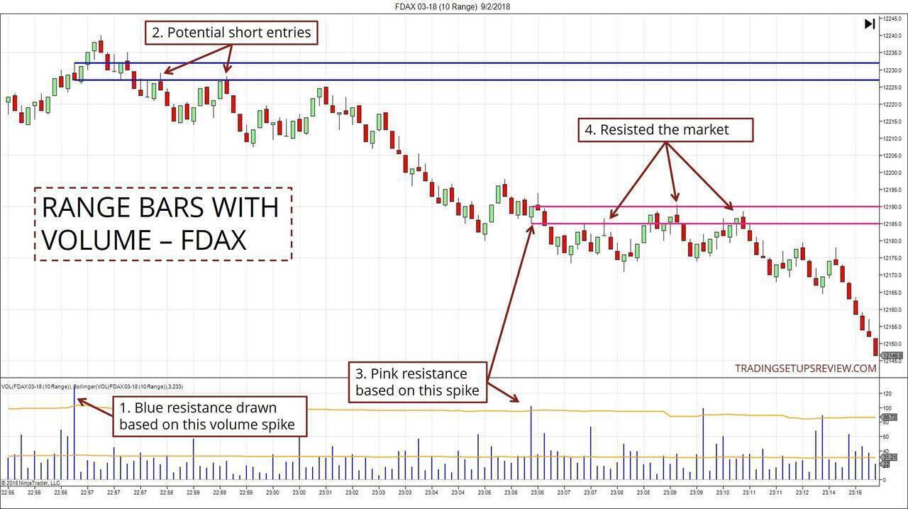
The FDAX chart above shows an orderly bearish market.
- We drew the blue resistance zone based on this volume spike.
- Two potential shorting points as the blue resistance rejected the price from rising. However, the first rejection took place after a very small breakout of the blue zone. Hence, it was not a reliable setup.
- Another resistance zone (pink) based on a volume spike.
- The pink zone was well-placed to help us enter the bearish market on retracements.
Conclusion - Range Bar Volume Spikes
By combining range bar charts and volume, you can map the market structure (S/R) with ease. This map will help you navigate your way.
Some ideas for using this market map:
- Scalping around the identified S/R
- Timing tool for entering the market after you perform your market bias analysis
- Profit-taking
- Confirmation of other trading strategies
Some tips for performing range bar volume analysis:
- Test and fine-tune for the range parameter that complements your trading style.
- Watch out for multiple tests of an S/R.
- Look for volume surges as the market tests the S/R zones.
- Historical range bar charts look nice. But in real-time, they can move at high speeds which might need you to change your trade execution tactics.
- Entering with a limit order as the market tests an S/R zone is a solid strategy, but stop-loss placement is trickier. Consider volatility stops.
Although analyzing range bar charts with volume does not offer a complete trading method, it has a huge potential for complementing most strategies.