10 Types of Price Charts for Trading
By Galen Woods ‐ 14 min read
Are you trading with candlestick charts? Find nine other fantastic price chart types to complement your trading. Change perspectives for better results.
Do you trade with the 5-minute chart? Or the daily chart? But why are we constrained by time bases?
Are there other ways to visualise price data? Do they offer valuable perspectives?
Here are 10 types of price charts to satisfy your curiosity.
(Beware. They might turn your trading perspective upside down.)
For easy comparison, we are using the same two trading sessions as examples for each chart type. One chart shows a clear trend while the other will shows a trading range.
1. Line Chart
2. Bar Chart
3. Candlestick Chart
4. Volume Chart
5. Tick Chart
6. Range Bar Chart
7. Point & Figure Chart
8. Renko Chart
9. Kagi Chart
10. Three-Line Break Chart
Price Charts with a Time Base
These three chart types are commonly plotted with a time base. It means that each data point on the chart comes from a fixed time period. For instance, if the time base is daily, each data point will represent price level(s) of each trading day. The charts below show the 5-minute time-frame.
Study of price charts began before technology was able to send market (tick) data instantaneously. Building charts with continuous price data was not possible. Hence, charts with a time base have become the standard in technical analysis.
However, these three chart types are not always plotted with a time base. You can also plot them with a tick or volume base as we will discuss in the second section.
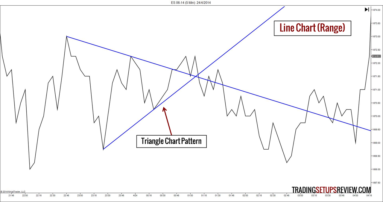
1. Line Charts
Constructing a Line Chart
It is extremely simple to build a line chart.
- Mark out the closing price of each time period
- Connect them
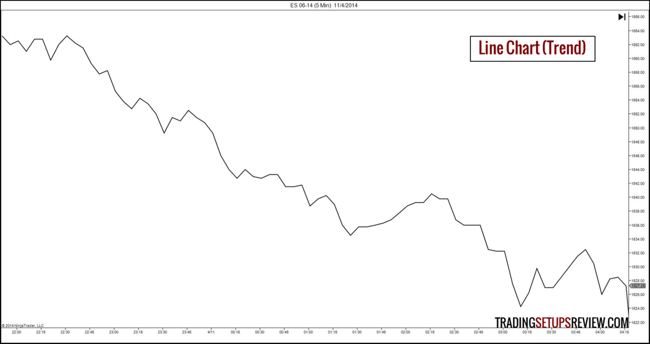
Trading with a Line Chart
A line chart does not offer much detail as it includes only the closing price of each period.
However, line charts are cleaner than other chart types. Hence, they are great for:
- Observing long-term trends
- Picking out chart patterns like Head & Shoulders and Triangles
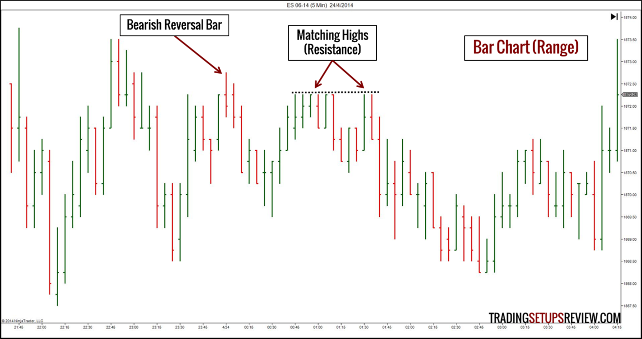
2. Bar Charts
Constructing a Bar Chart
To build a bar chart, we need the following pieces of price data from each time period.
- Opening price
- Highest price
- Lowest price
- Closing price
With these information, we can build a price bar for each time period. These four pieces of data explains why some traders call them OHLC bar charts.
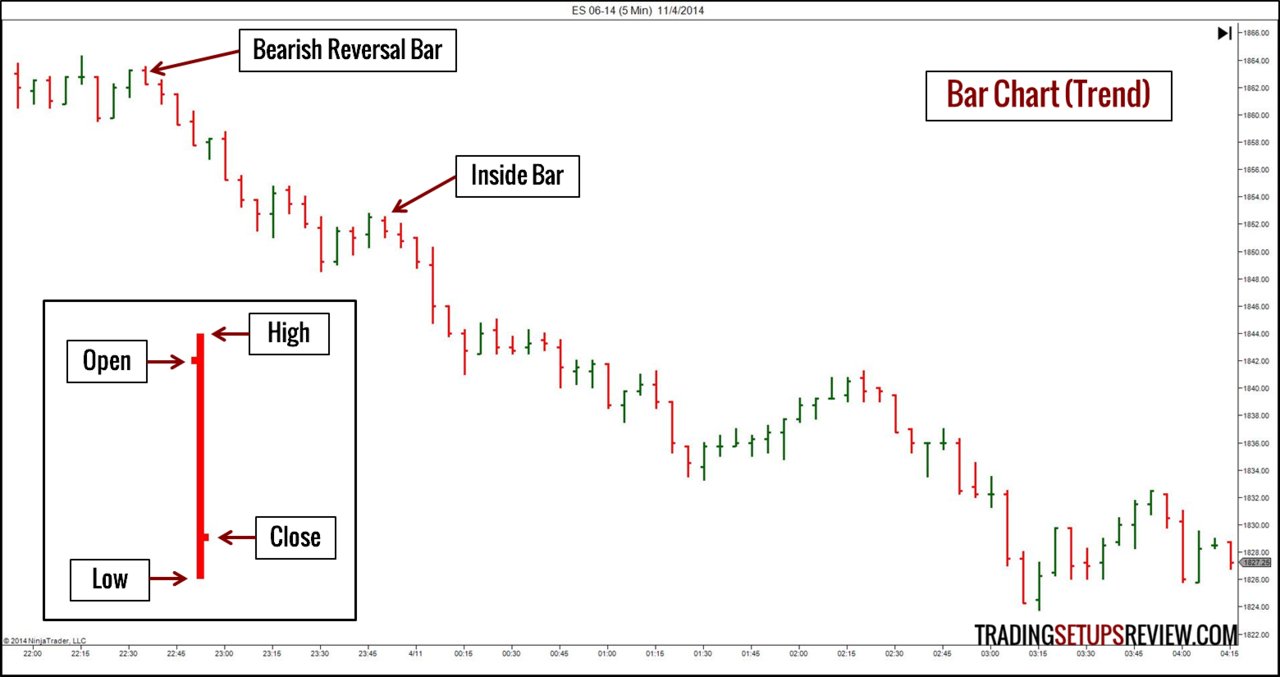
Trading with a Bar Chart
A bar chart has important details that are essential for timing our trades.
Armed with a bar chart, we can study the relationship between the highs, lows, closes, and opens of different bars to derive a whole host of bar patterns.
Look at the examples. Bar patterns are nifty timing tools that offer us trade entries with controlled risk.
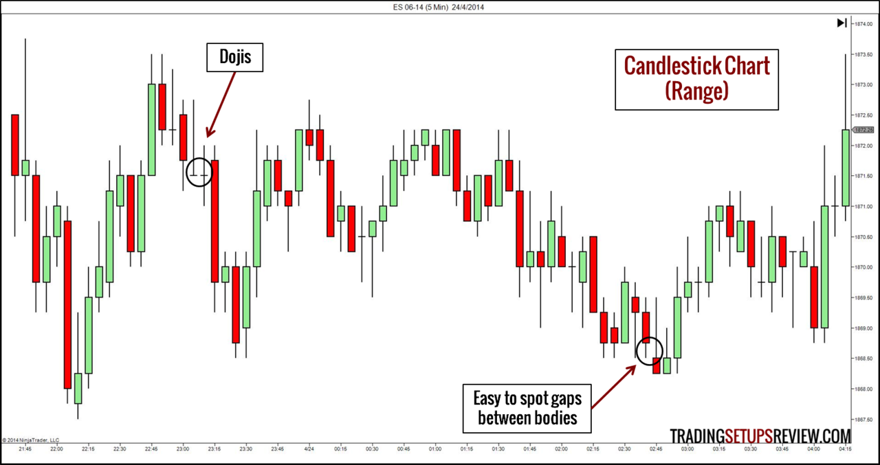
3. Candlestick Charts
Constructing a Candlestick Chart
A candlestick has that same price data as a price bar. They are similar, except for an enlarged region between the opening and closing price. The range between the opening and closing price of each candlestick is the body of the candlestick, which is its defining feature.
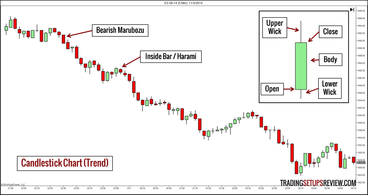
Trading with a Candlestick Chart
It is not surprising that candlestick charts have become the preferred choice for most traders. Other than being able to add various candlestick patterns to their arsenal, a candlestick chart does not dilute our ability to spot bar patterns. A rare chance to get the best of both worlds.
The relationship between the bodies of candlesticks is important to candlestick patterns. Candlestick charts makes it easy to spot gaps between bodies. (A candlestick with a body that does not overlap with the body of the preceding candlestick is a “star”.)
A slight drawback of candlestick chart is that candlesticks occupy more space than OHLC bars. In most charting platforms, the most you can display with a candlestick chart is less than what you can with a bar chart.
For more examples, read Three Basic Chart Types.
Price Charts with an Activity Level Base
Time can pass without market activity. This poses a problem to time-based price charts. As time passes, regardless of the level of activity in the market, the chart continues to print new bars or candlesticks. In such cases, time-based charts present an inflated impression of market activity.
To address this issue, some traders use the level of market activity (measured by volume or ticks) instead of time as a basis to sample price data.
There is an important caveat for activity based charts. You cannot get tick or volume charts from different data feeds to match up completely. This is due to filtering of the market data by your feed provider, and possible issues with your internet connection and computer performance. However, whether these issues outweigh the potential benefits of using tick and volume charts depends on your trading style and evaluation.
In particular, be careful if you intend to use volume or tick charts for spot forex trading. As there is no centralised market for spot forex trading, the volume or tick data is limited to your liquidity pool, which in some cases are only restricted to your forex broker’s clients. Thus, the volume or tick data might not be representative of the entire market for the instrument you are trading.
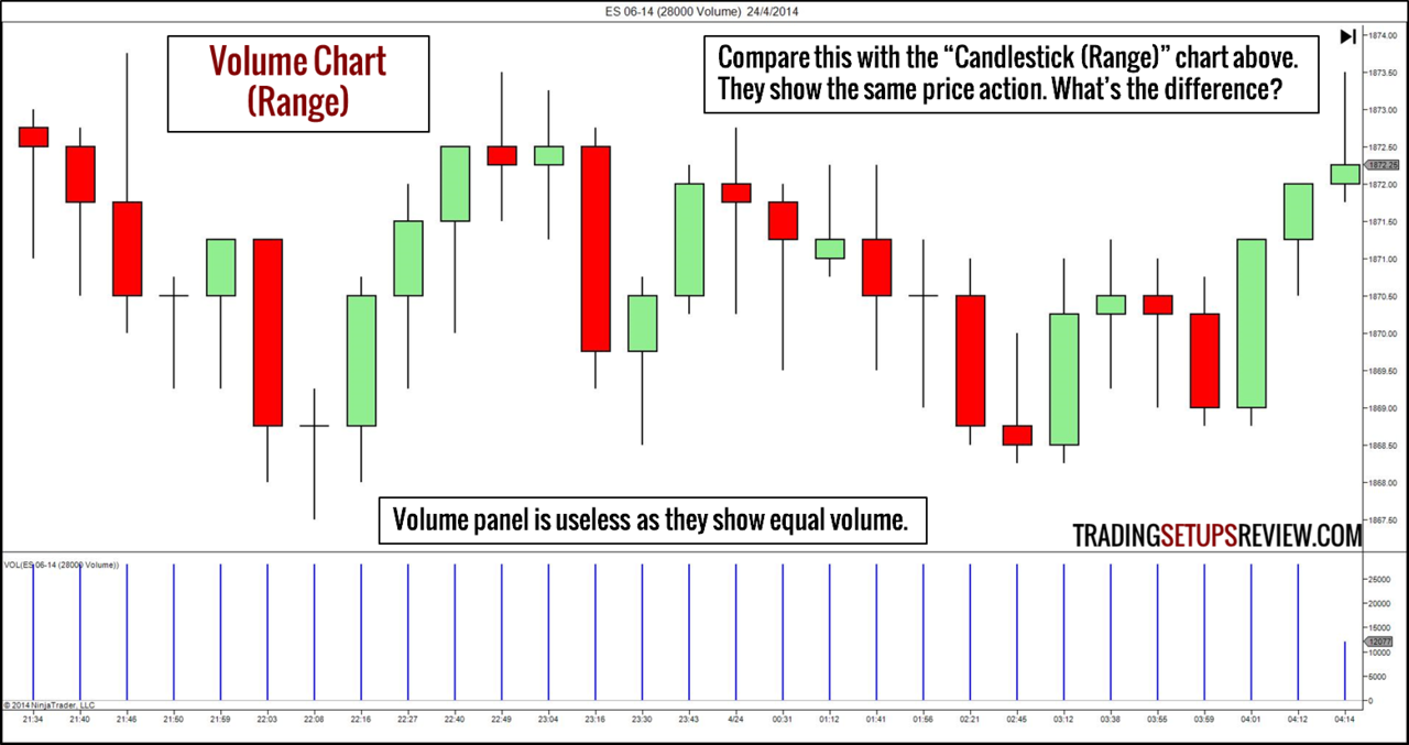
4. Volume Charts
Constructing a Volume Chart
Volume is the number of contracts or shares traded. It is the most direct way to measure the amount of market activity.
Instead of using the OHLC data of fixed time periods, we take the OHLC data from a volume block. Hence, on volume charts, each bar (candlestick) represents a fixed volume. For instance, a 233-volume chart will display the OHLC of a 233-volume block for each bar.
You can plot volume charts in the style of a bar chart or candlestick chart.
Not sure what setting to use for your volume chart?
A simple starting point is to use the average volume of your usual trading time-frame. For instance, we arrived at 28000-volume charts in the examples by measuring the long-term average volume of 5-minute ES bars.
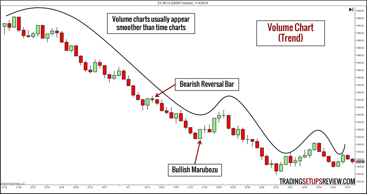
Trading with a Volume Chart
As a volume chart slows down when market activity is low, it shows less sideways movement. Hence, it tends to show smoother price waves that are conducive for trading. This is the main advantage of a volume chart.
Generally, you can still rely on bar patterns and candlestick patterns in volume charts.
However, using a volume chart has major implications on traditional volume analysis. A trader using volume charts can no longer:
- Look for volume patterns that support chart patterns
- Use volume to confirm if a break-out is valid
- Use volume indicators
- Employ Volume Spread Analysis
Nonetheless, if you understand the underlying concepts of the above techniques, you can adapt them for trading volume charts. For instance, to find high volume breakouts, look for price thrusts with consecutive bars moving in the same direction. As each bar represents a fixed volume, the consecutive bars represent a high volume swing.
Naturally, a basic volume overlay is useless. Instead, consider using a time overlay that shows the time taken to complete each volume bar.
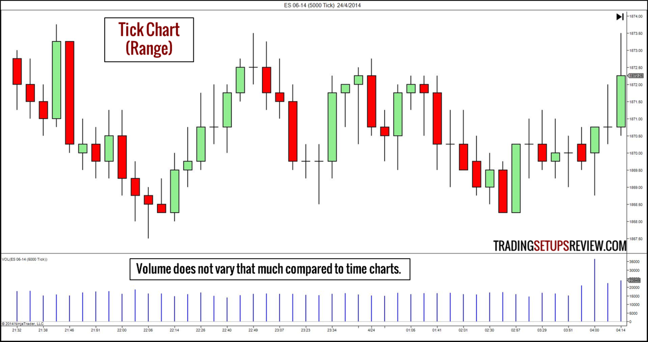
5. Tick Charts
Constructing a Tick Chart
In this context, a tick refers to a transaction. Like the volume traded, the number of transactions also measures the level of market activity. (Do not confuse this with the NYSE $TICK.)
However, the volume of each transaction differs. Hence, a tick chart does not replicate the volume chart.
Each bar/candlestick on a tick chart represents the OHLC of a given number of ticks.
The tick setting depends on the volatility of the market. When starting out, measure the average range of your usual trading time-frame. Then, adjust the tick setting to get a chart with similar volatility. Fibonacci numbers like 144-tick and 233-tick are also popular choices for tick charts.
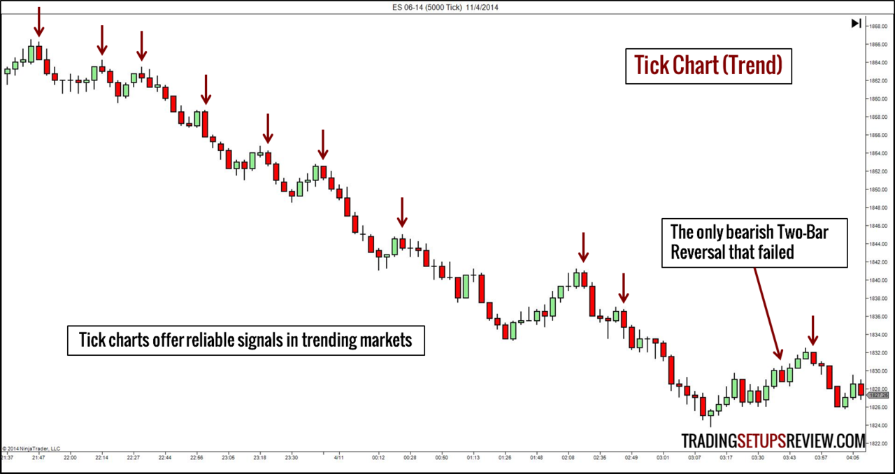
Trading with a Tick Chart
As with volume charts, short-term price patterns are still effective with tick charts. The example above shows that tick charts work well in trending markets. Do not take that as a sign that tick charts offer the Holy Grail. Many trading methods work like a charm in trending markets.
While volume analysis is possible with tick charts, you will find less variation in the volume of each tick bar as both tick and volume are measures of market activity.
For more examples on volume and tick charts, read Trading without Time.
Simply Price Charts
The next five price charts are simply price charts. They share a simple characteristic. They move only when price moves. If you are a price action purist, you will enjoy exploring the following chart types.
However, out of the five chart types below, the range bar chart is the only one that is plotted without any regard to time.
The other four chart types (P&F, Renko, Kagi, Three-Line Break) are built using a time-based chart that determines the chart update frequency. This is hardly surprising as traders developed them back in the days when continuous updating of prices charts cannot be done. For the examples below, we used a 5-minute bar chart as the underlying time-based chart.
Hence, only the range bar chart shows the exact price action. The other four price charts filter out “noise” using different techniques and do not show exact market prices.
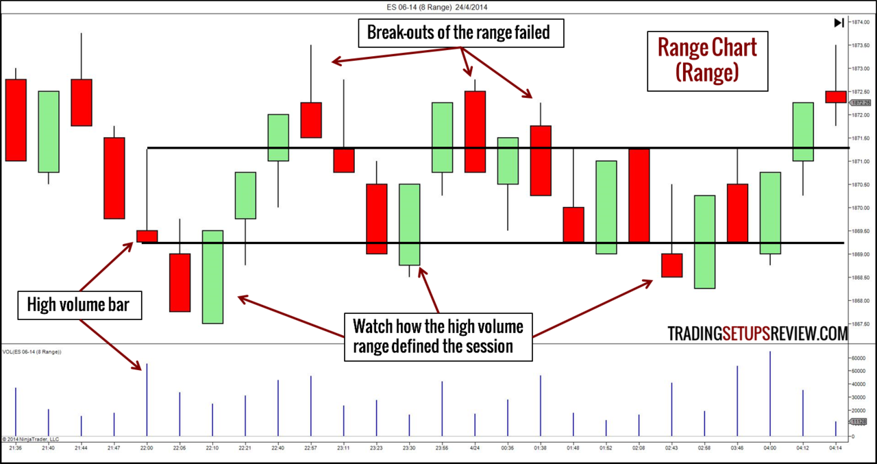
6. Range Bar Charts
Constructing a Range Bar Chart
First, specify a range. In a range bar chart, every bar will end once the range between its high and low equals the chosen range.
Thus, every bar will have the same bar range. In addition, every bar will close either at its high or low.
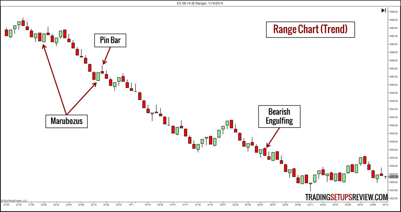
Trading with a Range Bar Chart
Due to the forced break after a fixed bar range, many bar and candlestick patterns disappear from a range chart. For instance, Harami patterns and inside bars will never show up on range bar chart. Of course, patterns like ID/NR4 and NR7 also become non-existent.
You will still find some patterns in range charts, and the prominent ones include:
Combining a range chart with volume analysis is an interesting approach. As every bar has the same range, you can easily pick up the bars that attract a high volume. These bars are potential support or resistance levels. Look at the example below.
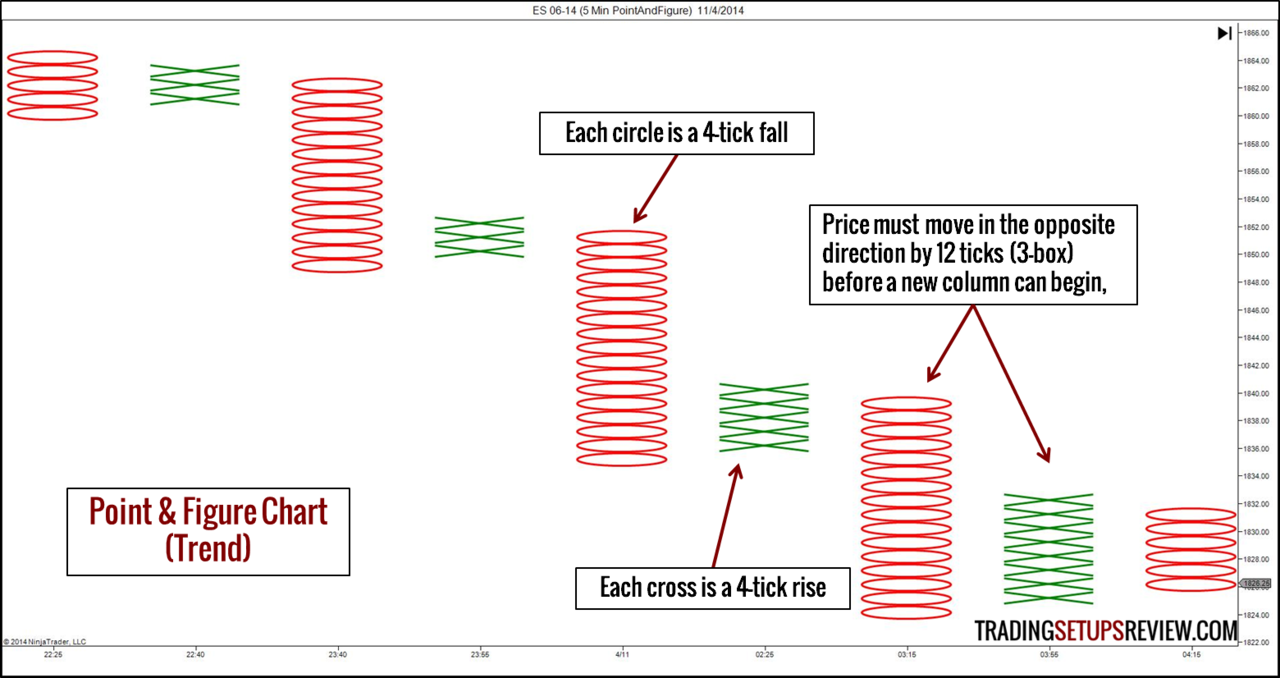
7. Point & Figure (P&F) Charts
Constructing a Point & Figure Chart
The first input of a P&F chart is the box size. For our example, let’s use 4 ticks.
- When the market rises, we draw a rising column of “X”. Each “X” represents 4 ticks.
- When the market falls, we draw a falling column of “O”. Each “O” represents 4 ticks.
- Whenever the market reverses, we draw a new column. Hence, you will never see both “X” and “O” in the same column.
How do we know if a market has reversed?
This question brings us to the second input of a P&F chart. We need to decide on a reversal amount. The standard reversal amount is 3-box. This means that for a rising column to end and a falling column to start, the market must drop by 12 ticks (3 box times 4-tick box size).
Our examples are based on the closes of 5-minute bars. It means that we update the chart using the closing price of 5-minute bars. (Using the high/low prices of each bar is also an option.)
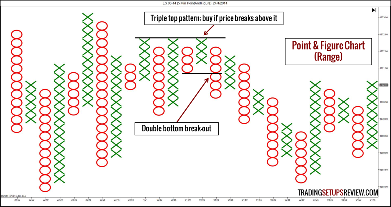
Trading with a Point & Figure Chart
Our examples show intraday charts for ease of comparison with other chart types. The fact is, however, P&F charts are more commonly used in daily and above time-frames.
There are chart patterns specific to point and figure charting. While they are simple break-out patterns, you will need some practice before you can pick them out. The good news is that the P&F chart patterns have clearer definitions than their counterparts on bar charts. In addition, P&F charts offer unique methods for projecting targets.
Trading with P&F charts is an in-depth topic. Refer to the following books to learn more.
- The Definitive Guide to Point and Figure: A Comprehensive Guide to the Theory and Practical Use of the Point and Figure Charting Method
- Point and Figure Charting: The Essential Application for Forecasting and Tracking Market Prices


These authoritative books will also offer insights on how to set the box size.
8. Renko Charts
Constructing a Renko Chart
Renko comes from the Japanese word for “brick”. To begin, we must choose a brick size.
The chart prints a new brick when the market moves more than the brick size away from the preceding brick. (Like the P&F chart, we can focus on only the closing prices or the high/low prices of the underlying time chart.)
This means that a Renko chart does not display the exact price action. It filters away whipsaws that are smaller than the brick size.
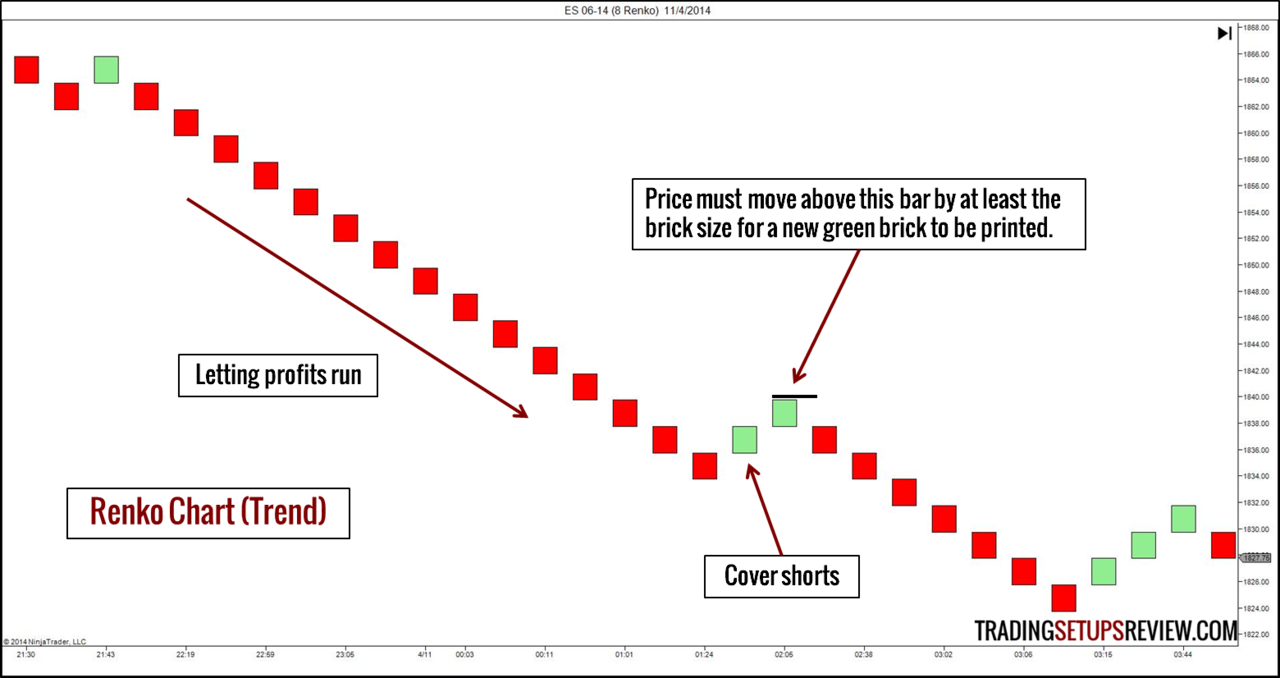
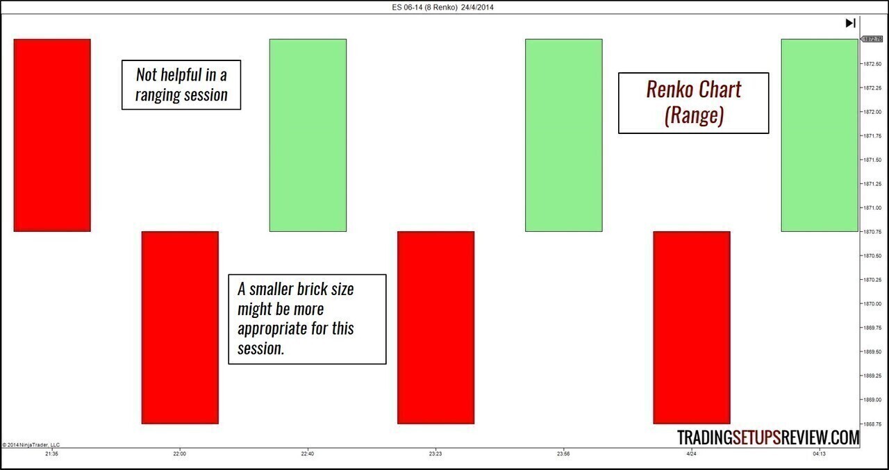
Trading with a Renko Chart
A Renko chart leaves no room for bar/candlestick pattern analysis. However, it excels at highlighting trends as it ignores “noise” movements that are less than the brick size.
Hence, we can use Renko charts for two purposes.
- Track trends on a higher time-frame with a large brick size setting. We can then take trades aligned with the Renko chart’s direction using a smaller time-frame.
- Guide us in letting our profits run as shown in the example above.
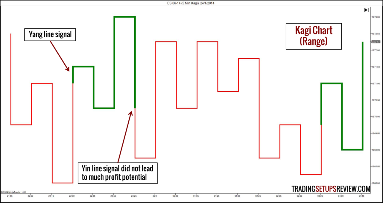
9. Kagi Charts
Constructing a Kagi Chart
The closest Western cousin of the Japanese Kagi chart is the P&F chart we touched on above.
However, a Kagi chart does not need a box size. All it needs is the reversal amount that you can specify in absolute price range or percentage change. Once price heads in the opposite direction by the specified reversal amount, the chart will change direction.
A distinguishing feature of a Kagi chart is the different line width. When the market goes higher than a previous swing high (shoulder), the line thickens (Yang line). When price breaks below a previous swing low (waist), the line thins (Yin line).
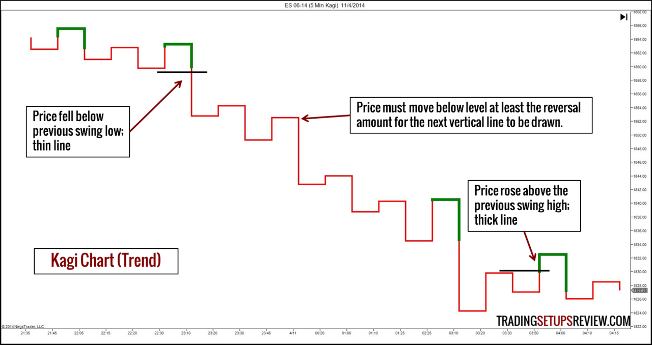
Trading with a Kagi Chart
With the Yin and Yang lines, a Kagi chart highlights the break-out of swing highs and lows. Hence, it is unwise to rely on it in a sideways market in which most break-outs fail. (Refer to example below.)
However, it is especially useful for tracking the market structure of swing highs and lows. Thus, a Kagi chart is effective for finding support/resistance and tracking the market bias.
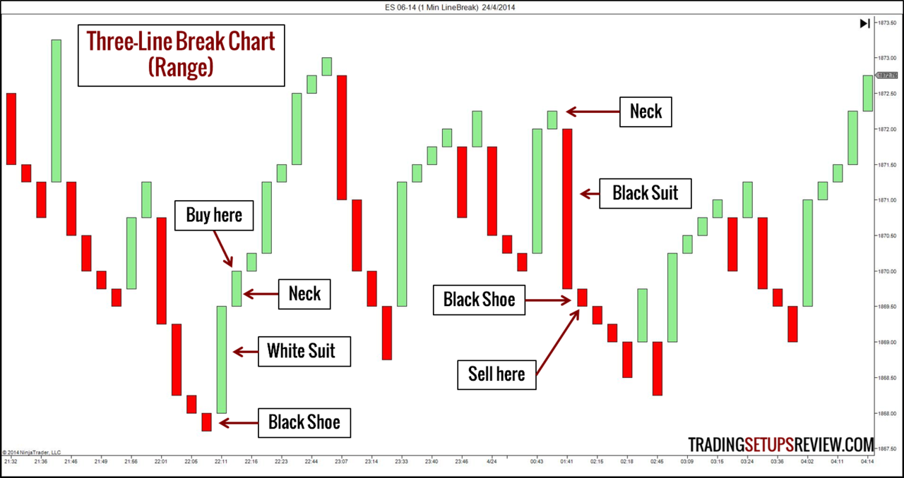
10. Three-Line Break Charts
Constructing a Three-Line Break Chart
A Three-Line Break chart is made up of “lines”. These lines are plotted according to the closing prices of the underlying time chart. (In the first example, the underlying chart is the 5-minute chart.)
A new line in the same direction is made when the underlying time-based chart closes beyond the preceding line in the same direction.
A new line in the opposing direction is made when the underlying time-based chart closes beyond the last three lines in the opposing direction. This is where it got its name from.
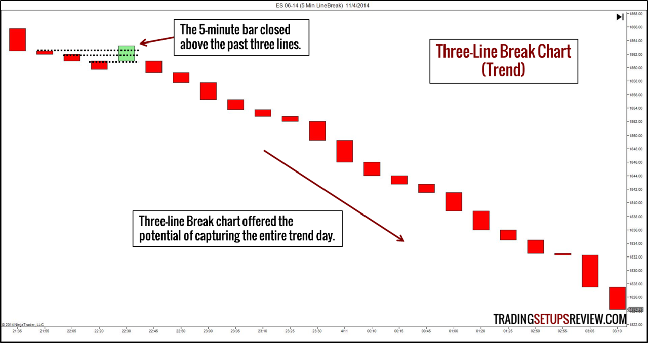
Trading with a Three-Line Break Chart
Standard trend line and support/resistance analysis will work well (or even better) on Three-Line Break charts.
While bar and candlestick patterns are not applicable, Three-Line Break charts offer a unique trading signal made up of three lines (black shoes, suits, and necks). A white suit means buy, and a black suit means sell.
Look at the chart below for examples. (We had to change the underlying time base to 1-minute for the trading signals to surface.)
To learn more about the Renko, Kagi, and Three-Line Break charts, you should definitely refer to Steve Nison’s Beyond Candlesticks: New Japanese Charting Techniques Revealed
What’s Next?
Move Prudently with New Price Chart Types
Using a new type of price charts has great ramifications on your trading. Make sure that you understand the consequences of factoring it into your market analysis.
Remember that the bulk of technical analysis was, and still is, designed with time-based charts in mind. This means that their effectiveness might be undermined in alternative chart types. Of course, you might also find pleasant surprises as you try them out.
A sound way to start exploring a new price chart is to use it as a complement to your current chart type. In addition to getting a second opinion, you are able to compare their efficacy.
Checking out new chart types is certainly interesting. Initially, it might even look like a promising candidate for the Holy Grail. However, eventually, you will realise that every chart type has its drawbacks.
Check the Implementation of Alternative Price Charts in Your Charting Platform
While most charting platforms offer time-based charts, the availability of other chart types differs among platforms. Furthermore, the implementation of these alternative chart types might not be consistent, given their relative obscurity.
For instance, NinjaTrader’s range bar charts have a gap between bars while the range bars in QuoteTracker do not.
Read your charting software’s documentation. Ensure that you understand how your charting platform builds the chart and are comfortable with the formula that goes behind the chart plot.
Have fun!
Bonus Candlestick Chart Type: Heiken-Ashi